
A personal product design project
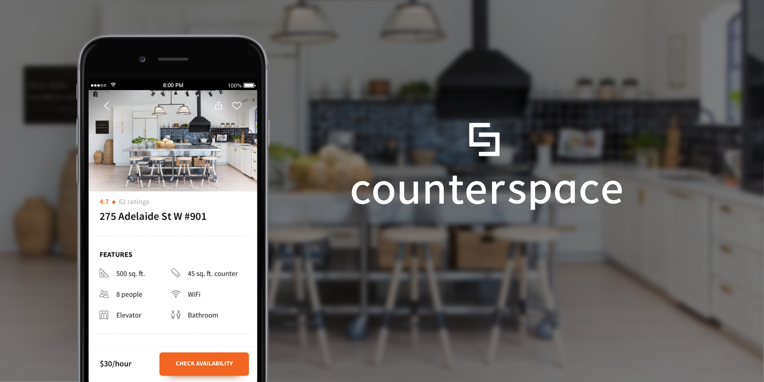
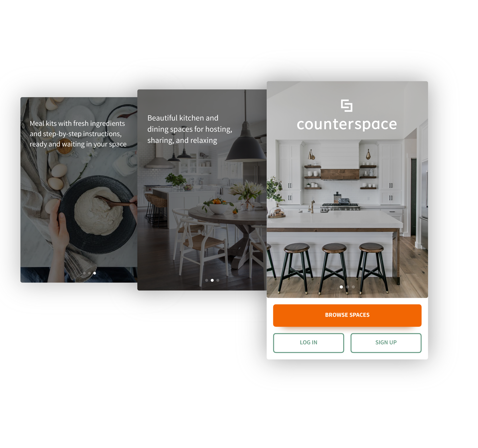
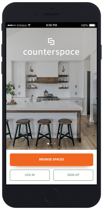
With Counterspace, you can find beautiful kitchen and dining spaces for hosting, sharing, and relaxing. Meal kits provide fresh ingredients and step-by-step instructions, ready and waiting in your space.
ROLE UI/UX Designer
CONTEXT Personal Project
TOOLS Sketch, Invision, Principle, Moqups, Illustrator
GOAL To provide more counter space!
LOGO & WORDMARK
The Counterspace logo is two angular, interlocking "C"s that mimic the layout of a large kitchen counter. An "S" is formed in the literal "counter space" between the two letters. The logo can also be interpreted as two friends hugging or a visual representation of balance.
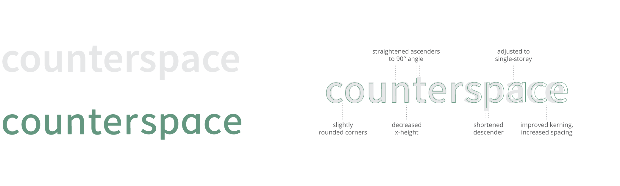
The wordmark is set in a customized Source Sans Pro. To make it more friendly, adjustments include a single-storey lowercase "a", rounded corners, decreased x-height, and increased tracking. The width of the letters is consistent with the width of the shapes in the logo.
COLOURS & ICONOGRAPHY
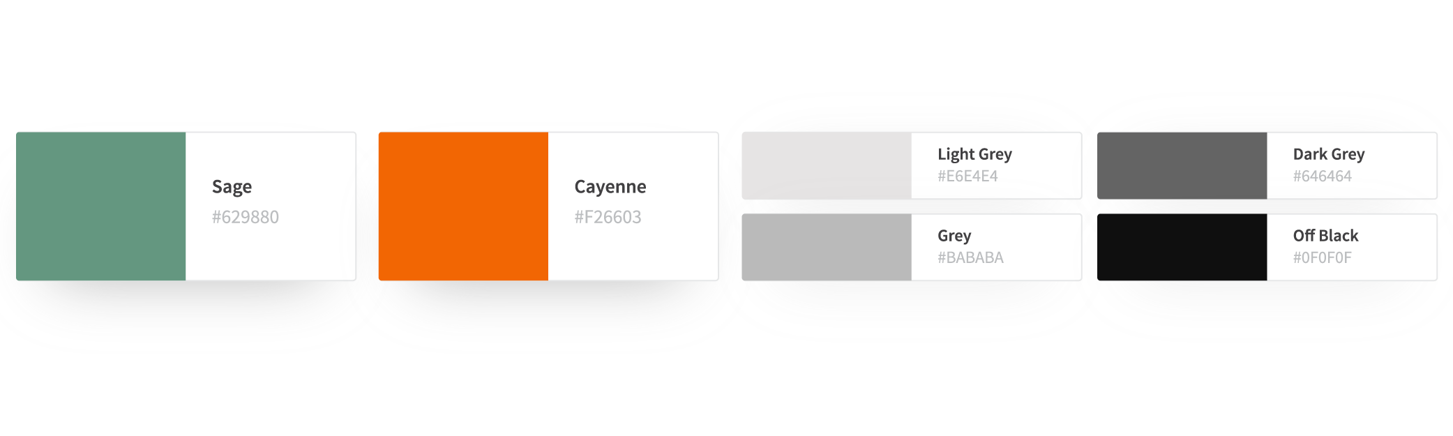
The visual language of the Counterspace app is simple and sophisticated. Rounded rectangular shapes echo from the logo to the custom icons to the buttons. The slightly pretentious brand colours are Sage (for a fresh and calming overall look) and Cayenne (for bright calls to action).
THE PROBLEM
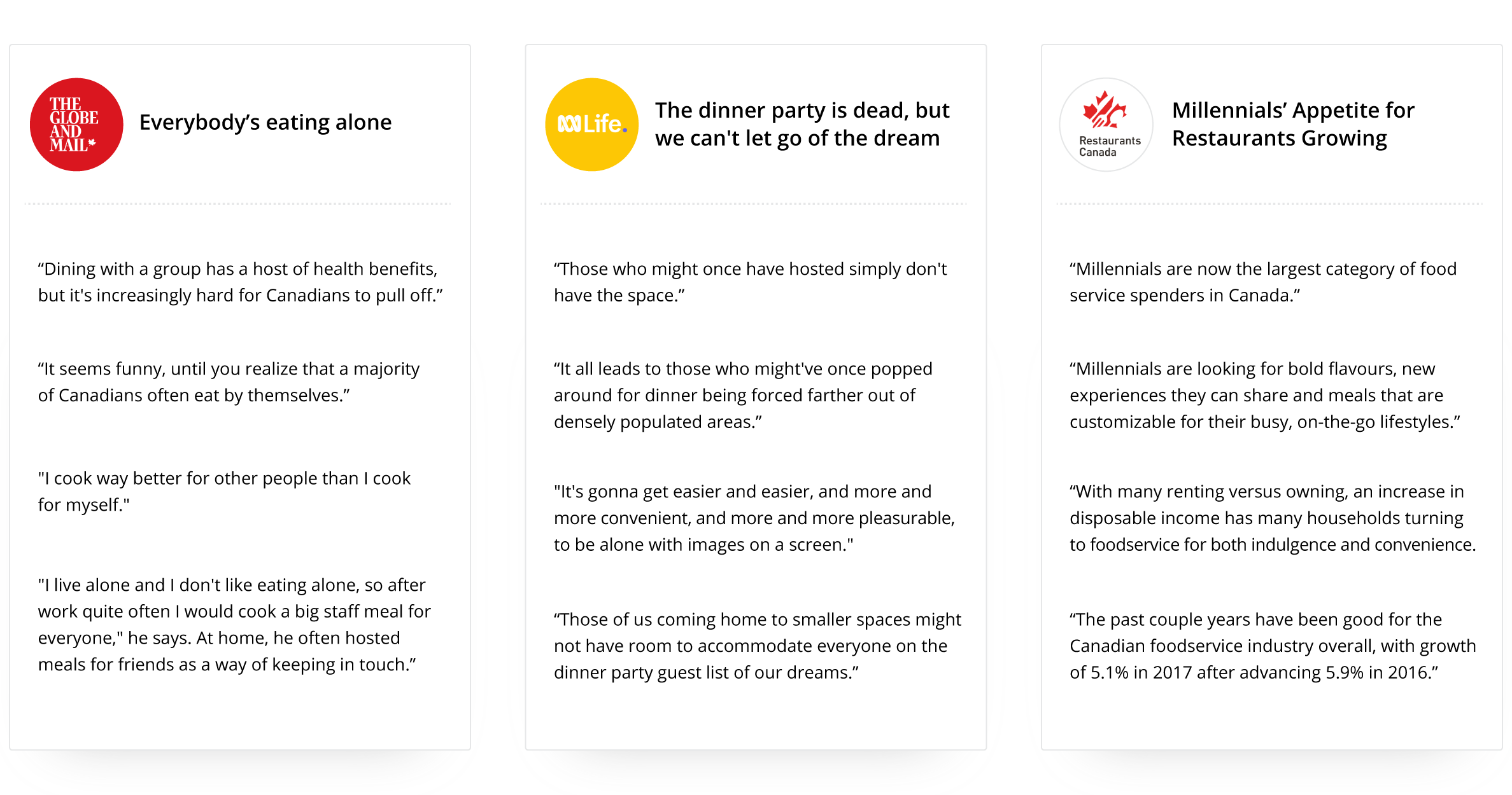
As cities grow, living spaces shrink. Young adults want to host and cook for their friends, but apartments rarely have the space. Kitchens are tiny and lack equipment, while dining areas are often defined by a single table or couch. Other deterrents include cleaning up before and after, washing dishes, and planning a meal. Yet, “with many renting versus owning, an increase in disposable income” means that city-dwellers have a large budget for food and entertainment.
THE SOLUTION
Airbnb provides living spaces, Breather provides meeting rooms, and Thisopenspace provides venues. There is currently no service that provides kitchen & dining spaces. Counterspace fills a gap in the market.
Humans are increasingly seeking experiences over consumerism. This especially applies to food. Increased interest in home cooking is reflected in the recent popularity of meal kits. The delivery services introduce an accessible, convenient way to cook at home. They provide pre-measured ingredients, thereby reducing food waste. However, individually wrapped ingredients increase packaging waste. Meal kits are delivered with insulation, ice packs, and printed recipe cards that are packed in a bag which is sealed in a box. By putting ingredients directly into the fridge and pantry in reuseable containers, Counterspace provides the convenience of meal kits without the negative environmental impact.
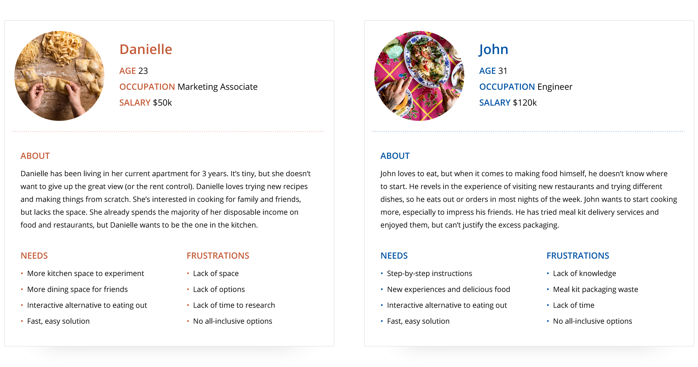
PERSONAS
Common frustrations included a lack of space, time, and resources, while common desires were to eat, cook, and experiment in the kitchen. The demographic is young, adventurous, and tech-savvy. Secondary uses for Counterspace: start-up test kitchen; venue for events, team-building activities, or cooking lessons.
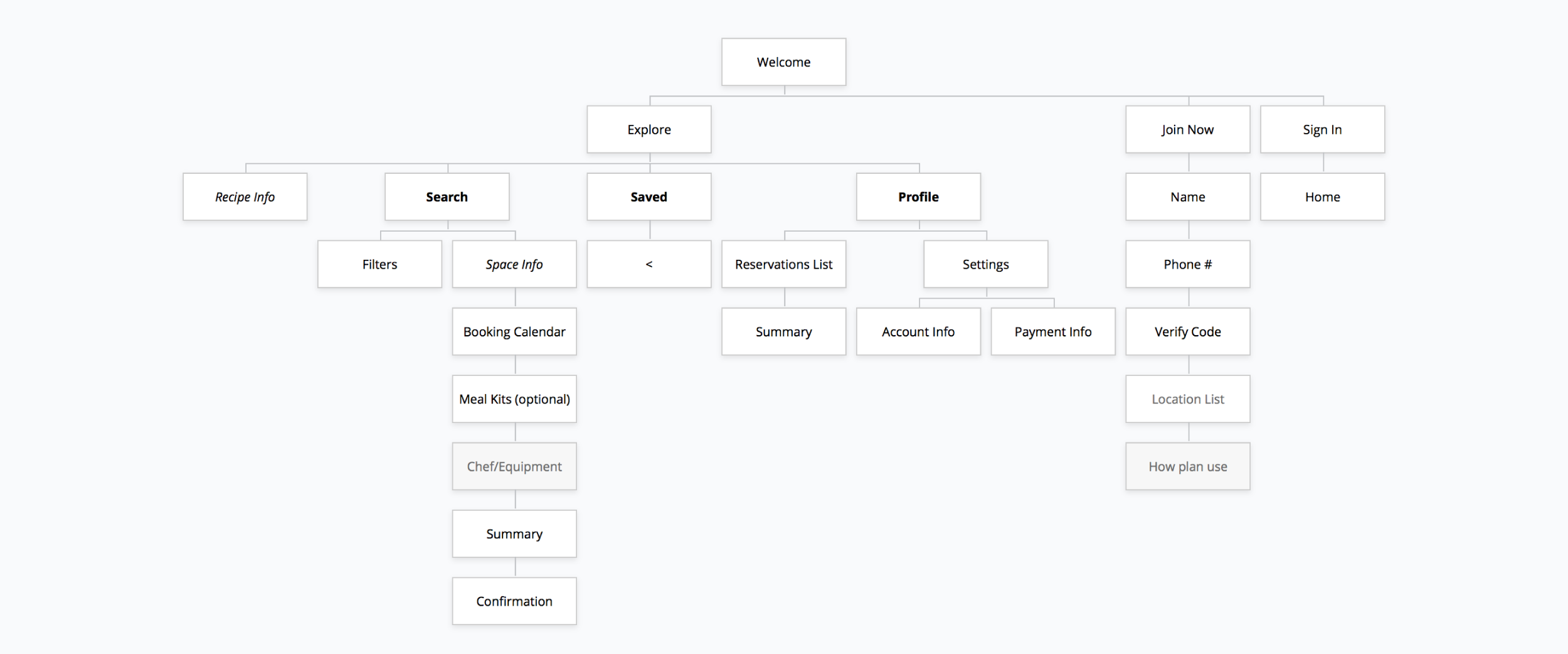
INFORMATION ARCHITECTURE & WIREFRAMES
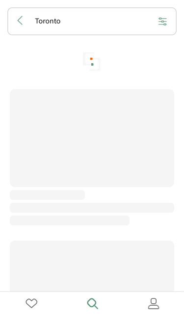
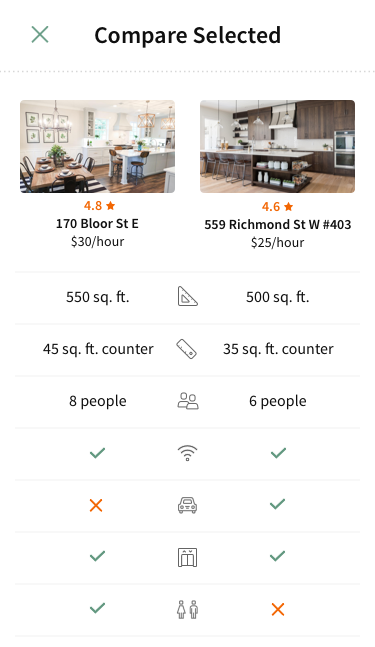
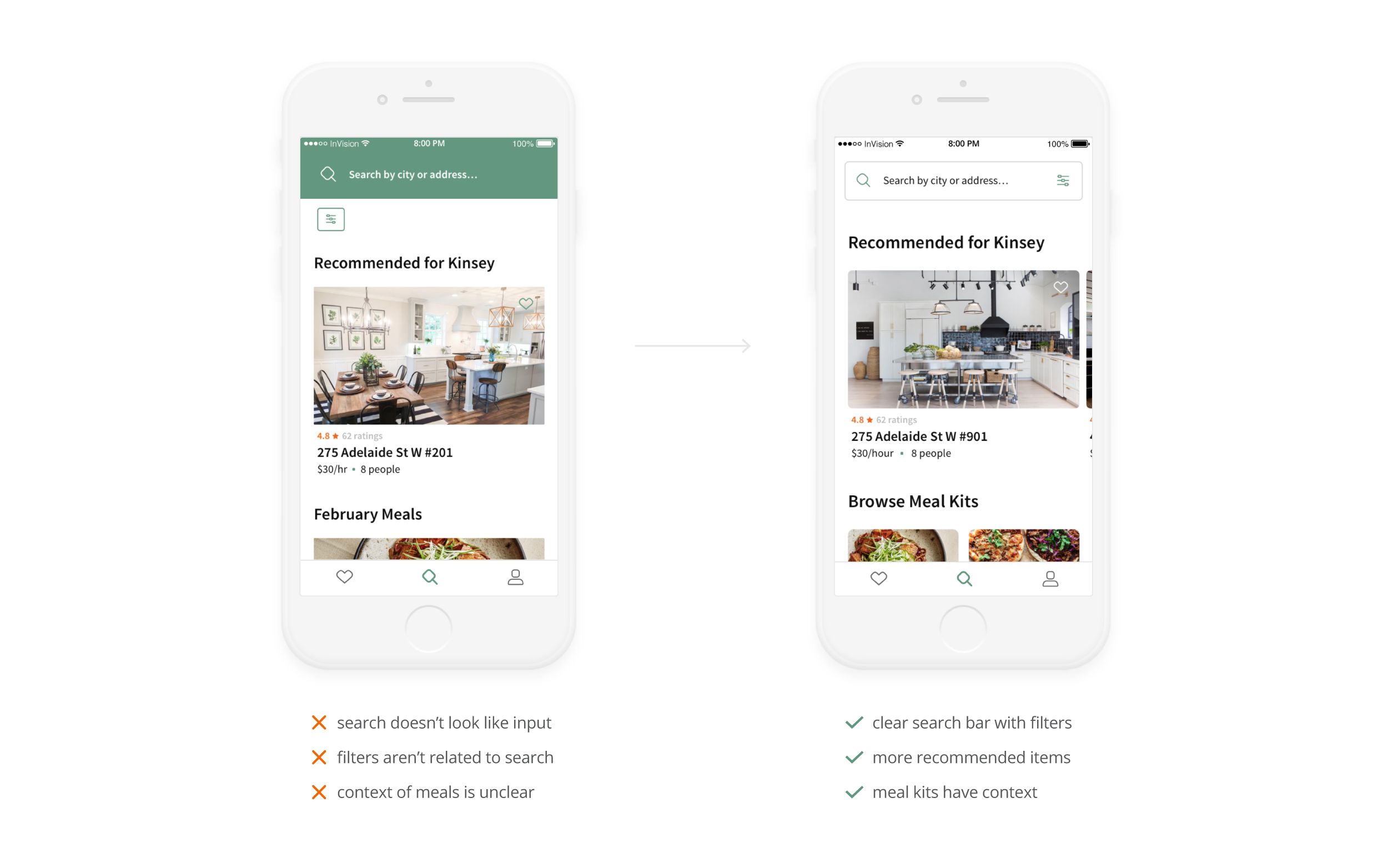
The information architecture mapped the flow of the app. The wireframes planned the scale and placement of UI elements before considering the visuals. The goal was to create an intuitive, logical sequence of events. New features were added based on necessity, like the Comparison tool (comparing the details of two space on one page) and the Gallery screen (viewing all photos of a space on one grid).
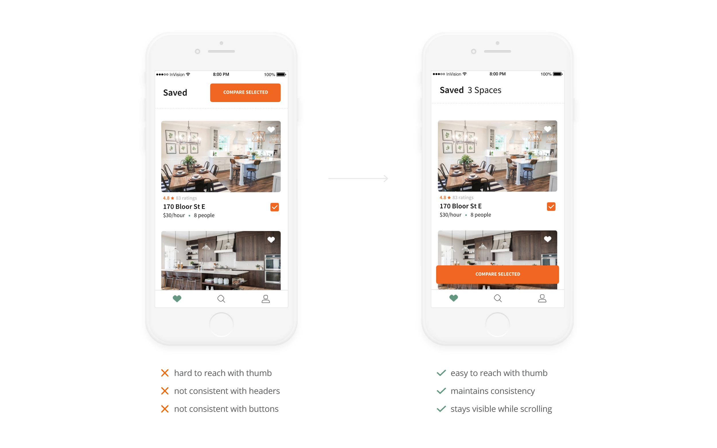
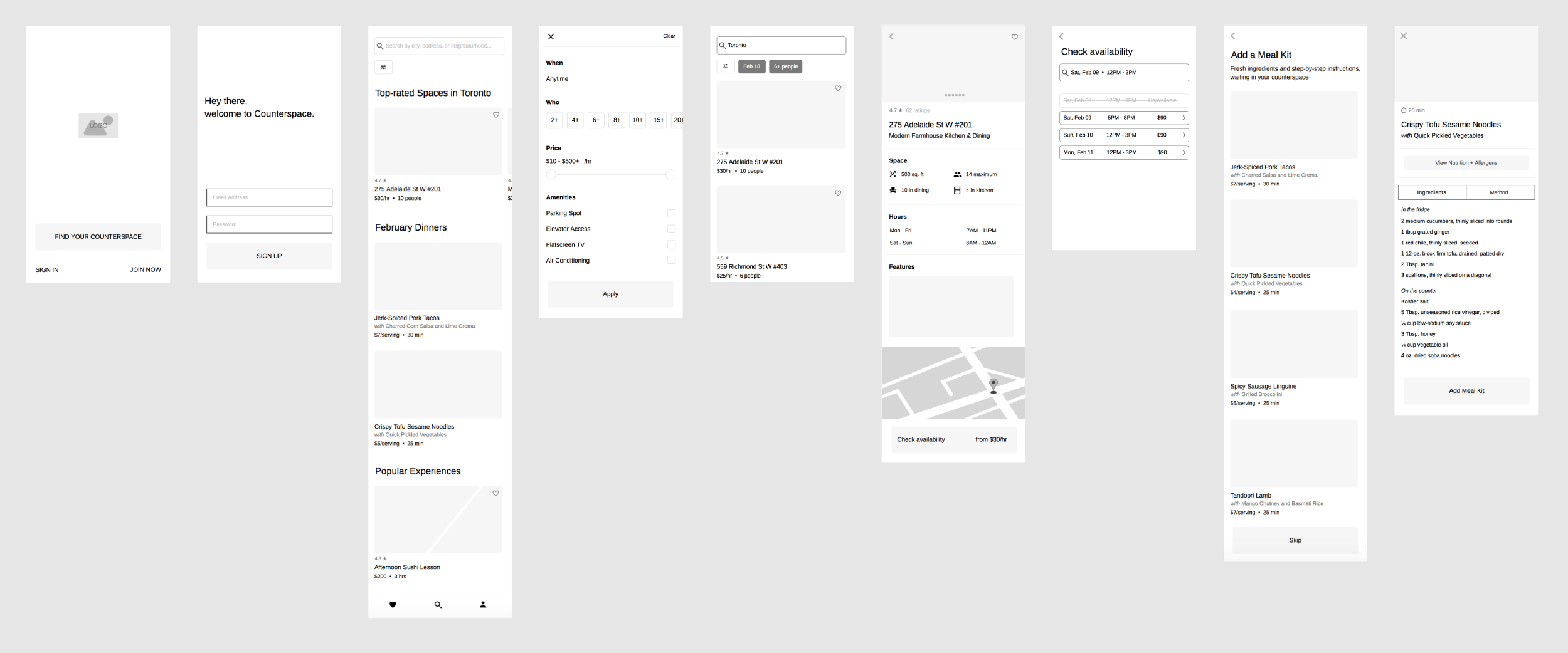
DESIGN & USER TESTING
Feedback from user testing informed design changes like improved button placement, clearer UI elements, and more concise copy. For example, on the Saved screen, the Compare Selected button was inconsistent, hard to reach, and not always visible. All of these issues were resolved by moving it to the bottom of the screen and making it sticky.