
A personal UI/UX project
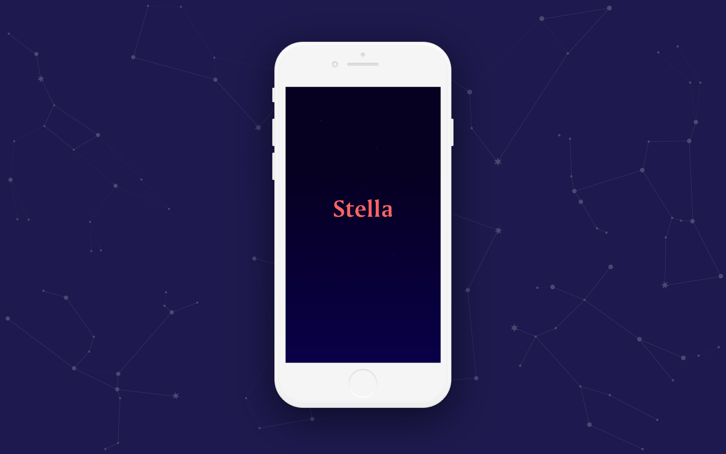
Every night, Stella points you in the direction
of the clearest, brightest constellations in your sky.
ROLE UI/UX Designer
CONTEXT Personal Project
TOOLS Sketch, Invision, Principle, Illustrator
GOAL To create a beautiful and simplified star-gazing experience

FRIENDLY
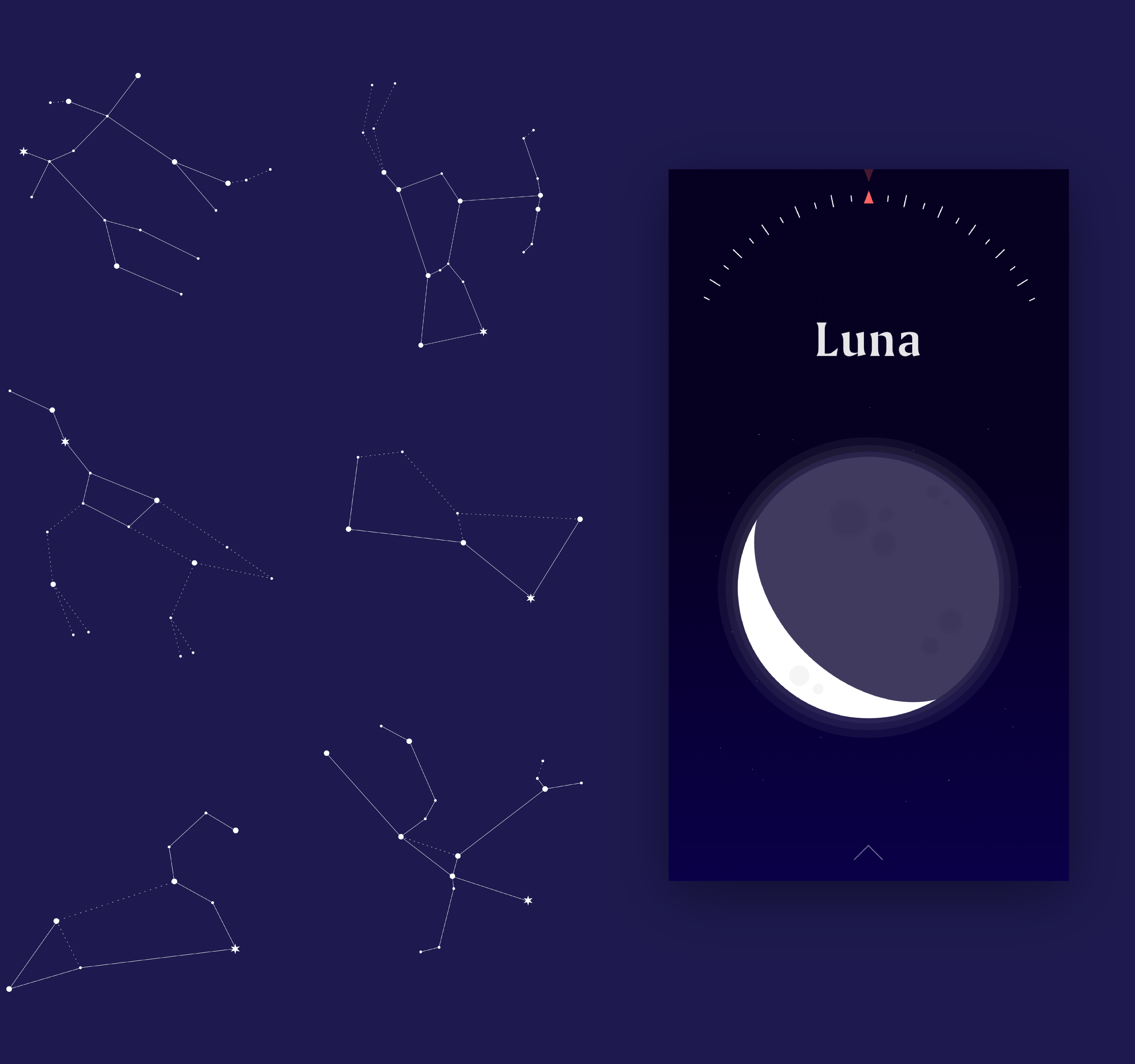
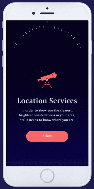
Stella uses your location's weather data to display a personalized selection of the brightest constellations in your area. If there's zero visibility, Stella doesn't give up! Instead, you can explore the current phase of the moon. Since the target audience includes children, the design style is fun and visual.
ENGAGING
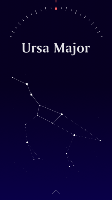
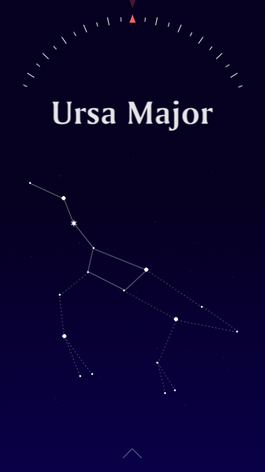
Many star-gazing apps use virtual reality to show every existing constellation, whether it's visible to you or not. This causes disappointment when the app is more exciting than anything you can actually find in the sky. Stella avoids this by using a simple compass to point in the direction of individual constellations.
INTUITIVE
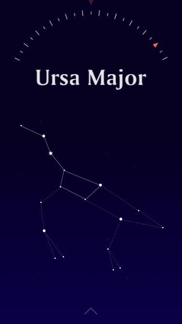
Stella primarily uses familiar swiping gestures for navigation. One constellation is displayed at a time so you can focus without being overwhelmed with information. Swipe sideways to switch between constellations or swipe up to view more information. The background, compass, and arrow elements remain constant.
CONCISE
Star-gazing apps often present an excess of information riddled with jargon. Stella educates and entertains you by gradually offering basic information in an interactive way. Tap a star to show its name, tap and hold a constellation to reveal its namesake, or swipe up for a summary of interesting facts.
WORDMARK & COLOURS
"Stella" is Latin for "star". It's also a familiar human name, which projects a friendly and approachable persona. The workmark is set in Amerigo BT, which is the font used in various weights and styles throughout the app. It's a sophisticated typeface that features whimsical flared serifs.
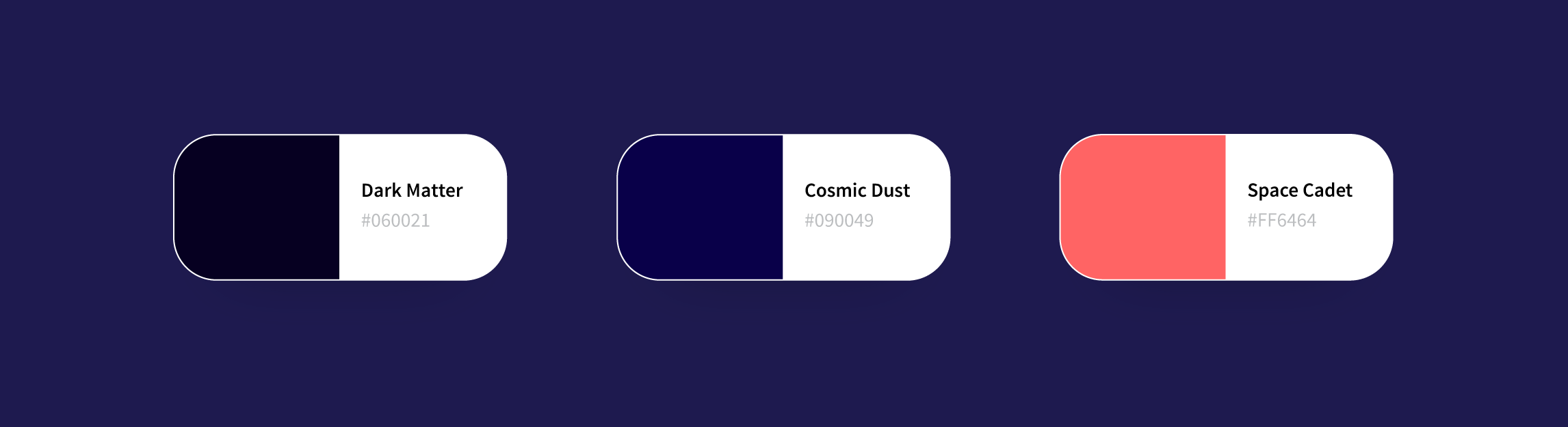
A deep indigo gradient of "Dark Matter" to "Cosmic Dust" mimics the night sky as the perfect background for white constellations. "Space Cadet", a bright, milky coral, is the fun accent colour used for emphasis. It allows the logo, icons, and buttons to pop on the dark background.
ICONOGRAPHY & COPYWRITING
The custom icons are playful and bold, just like Stella. The tone is pleasant and informal. Facts and figures are presented in an accessible way that's easy to understand, without ever pandering or oversimplifying.